Making Photoshop Composites more believable.
Making Photoshop Composites more believable
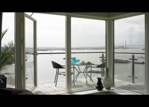
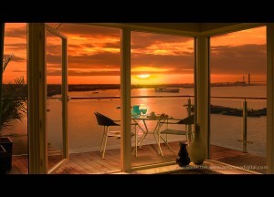
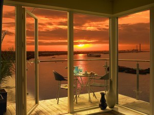
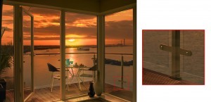
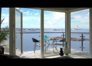
This blog is not meant as a step by step tutorial, but more of a guide for those who have a good understanding of Photoshop and need some ideas on how to make their Photoshop composites more believable. Below are before and after shots showing the retouching I’ll be discussing (figs.01 & 02). These shots are used with kind permission of Paul Eccleston at Arthouse Advertising Photography.
A Brief Overview of what’s been done
The sunset view was shot on a different day before the apartment was even built. I have added this view and then changed light and colour values of the original interior shot to match. These are the basics, but in addition to this I always look for as many ways as possible in which the two images can interact with each other. This is what will make the difference between a Photoshop composite looking believable or not. Sometimes small details added are barely noticeable in the final image, but would stand out like a sore thumb if left out.
Starting Point
As the colour needs to have some large alterations I have gone back and reprocessed the original RAW file. I could have alternatively made adjustments in Photoshop if there was no RAW file available. I would always recommend using adjustment layers, especially in a case like this, as it is likely I will need to go back and make alterations. A huge amount of warming up is obviously needed, but in addition to this I have added saturation, taken the exposure down and increased the contrast using curves i.e. making an “S” shape to the curve.
The Tedious Bits
First I use the pen tool to draw around the window frame. This can be a bit time consuming, especially if you’re as fussy as me, but it’s well worth doing as it will make life easier later on. In addition to this I will make a selection from the path, apply a small amount of feathering, make any adjustments in quick mask mode and save the selection which will be in the channels pallet.
Bringing in the view
The sunset view can be brought in on a layer above the original image and a layer mask applied to hide the unwanted areas using the selection made earlier. Positioning of the horizon is very important here. This example is simple as I have been able to match to the original horizon. If it is not obvious where the horizon line is you can use perspective lines to locate it as in fig.04.
Also important is scale of the sunset image. Again I use the original as a guide. I have shifted the sunset view to the right a little so the sun is not blocked by the door frame.
I have also applied a very small amount of blur to the view to allow for depth of field. I prefer to use Lens Blur. It’s slower to work with, but gives a much cleaner, photorealistic result. Without this subtle change the view would look unrealistic and too sharp.
Blending of images
At this point we can look at the composite and see the two images are not really working yet (fig.05)
The interior is looking very yellow compared to the red sunset. It is quick to reprocess the image: lay over the top of the original background layer and re-apply the mask from my saved selection. I could alternatively make alterations in Photoshop to any existing adjustment layers or add new ones if needed.
Also the sun on the original image was at a higher angle making the deck too bright and, to a smaller degree, the beach area on the left hand side. These should be darkened down on separate layers. You can use one or more of several options from an adjustment layer (Levels, Brightness/Contrast, Curves or Hugh/Saturation) to painting on black at a very low opacity or using a non destructive Dodge/Burn layer. To get the colour strength and contrast levels right I actually used a combination of all of these in this example.
Here’s how the image is looking now (fig.06)
The all important final touches
So what’s still wrong with this Photoshop composite?
Firstly, the colour graduation around the sun needs tidying up. I have done this using colorize in a Hugh Saturation adjustment layer and masking out as necessary.
Secondly, I need to add glass to the windows and around the balcony. The four windows have had low opacity white painted on a separate layer. In addition I have overlaid low opacity grey to the open door and right hand window, which are at an angle. The balcony glass is tinted so I have added a low opacity grey using the original image to get an accurate shape to the panes of glass. The edging of the glass is very important here. A white line is needed where light reflects off the bottom of the glass and a darker line where the sides and top are visible (fig.07)
Thirdly, I have deliberately left a certain amount of light on the decking as the balcony is an important part of the shot and I don’t want it to be silhouetted. I have imagined this light has come from inside, effectively reversing the main light direction in this part of the image. To draw attention to this and pull your eye towards the balcony furniture I have added highlights and shadows to the table and chair legs.
Here’s the final image again;
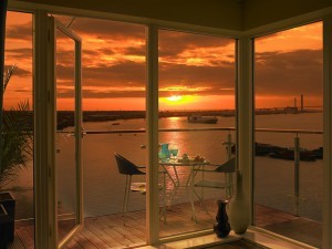
To give an idea of what can be done, here is another Photoshop Composite from the same original.
You can also see full screen versions of these images in my portfolio section on this website. https://www.adshotsdigital.com/high-end-retouching-portfolio-gallery/
I have assumed you know Photoshop reasonably well in this blog. If there are any points you are not sure about please leave a comment.


